website
ELEONOR
Portfolio
COMPANY & Client DESCRIPTION
Founded in 2013 Eleonor is a modern, minimalist women's jewelry line with a focus on versatile and timeless pieces. We believe that quality jewelry doesn't have to be expensive
UX Approaches
Project Definition & Scope
short brief about company
Eleonor is a modern, fashion-forward line of women's jewelry our company found in UAE (2012) we sell our product local and and we append in 2015 with over 8 store around world with pandemic we switch to sell online
Who is the Product For?
the target is women between age 25 35
Why does the Product Add Value?
collections are designed to be versatile and timeless. From earrings and necklaces to bracelets and rings that make of all product came form same brand and add more felling uniqueness
What basic features does the product offer?
offering the best possible customer experience, from the moment you begin shopping with us to long after you've received your purchase.
problem Statement
we need website can make our business better to our customer our old method to be online its to post in social media pages or another seller online
who ? affected with problem
with no website to company to can purchase our products we know the website is very important to any company but we know it was mistake but our budget in that time not enough
what ? problem
we need to sell more and expand our company globe and for customer to reaching our product any were for that we need website to solve that problems and to make our brand standout with other coemption
Why? s this important
solve thee problems and to make our brand standout with other coemption
Understanding the Problem
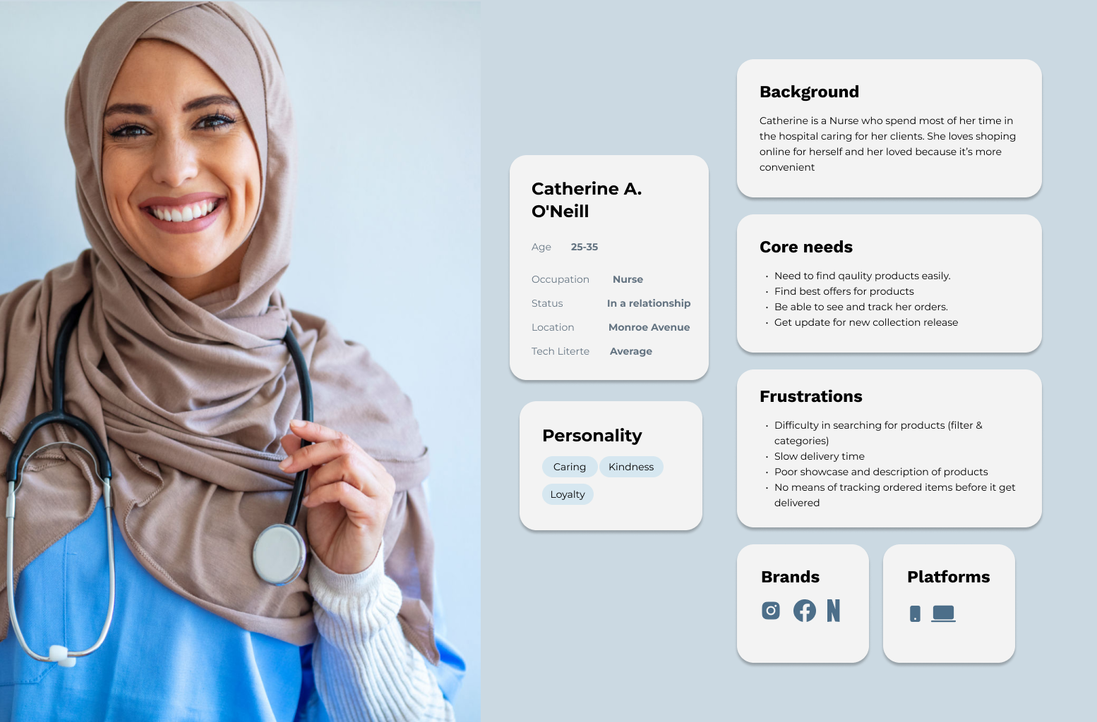
User personas
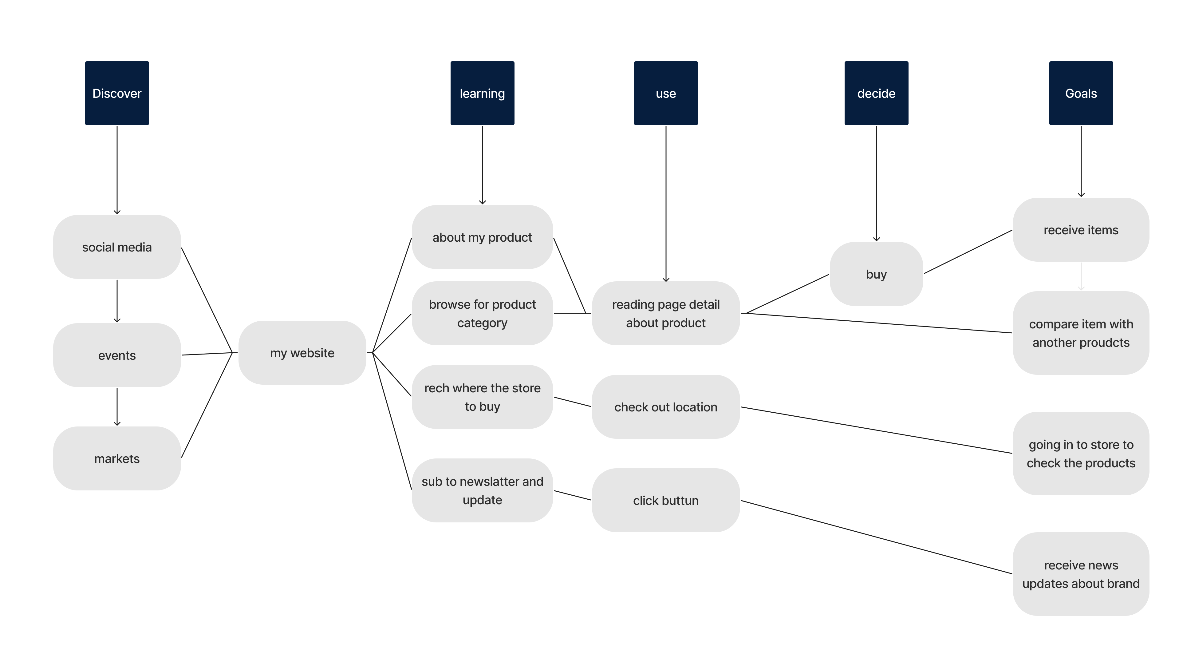
User journey maps
UX Research
what user need?
simple website and navigate to purchase item and make process clearing
what user struggling?
with complex ui he need specific item and he Feeling lost with that process
how can help user?
with make ui simple as possible and Access item in home page and make clear what category that brand offer
Competitive research
best practices
- Use clear, large images to show different categories
- A Simple Layout
- A Clear Site Navigation
- Pay attention to the uniformity of your jewelry product images
- Competitive research
- Use Category Names that are straightforward and easy to understand
the method i use is swot
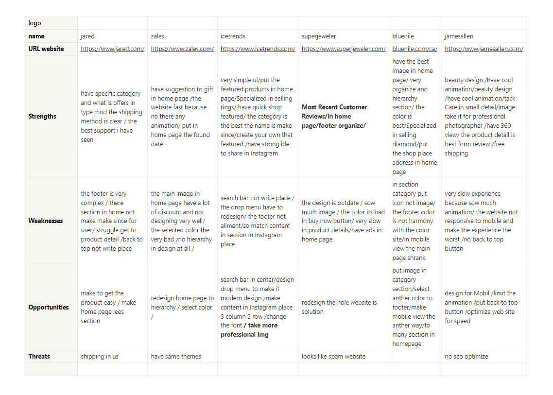
the result
- website have ui simple and hierarchy respect and color respect and modern design
- make footer sample
- lees section specific in home page toc catch eye and not make user confuice and not make complex
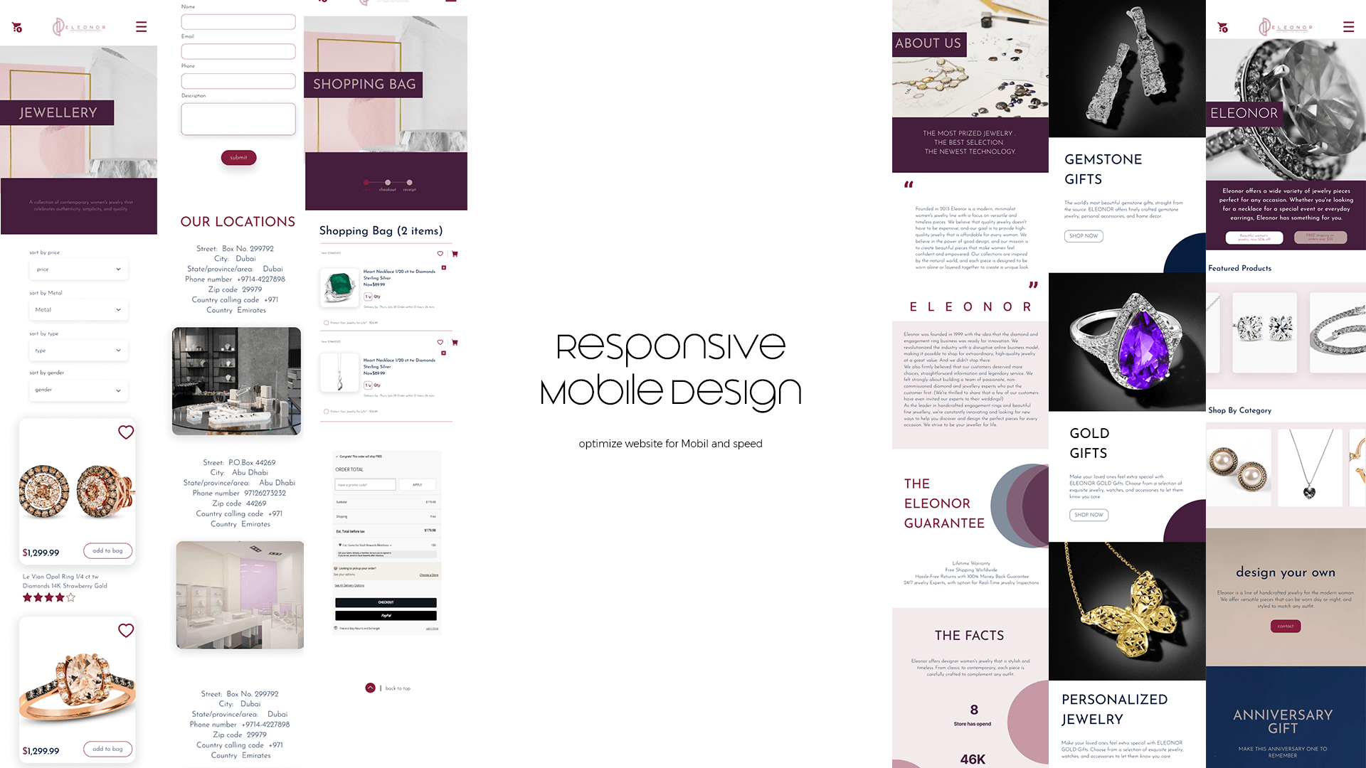
- optimize website for Mobil and speed
- take image and make image like brand
Ideation
user flow

sitemap
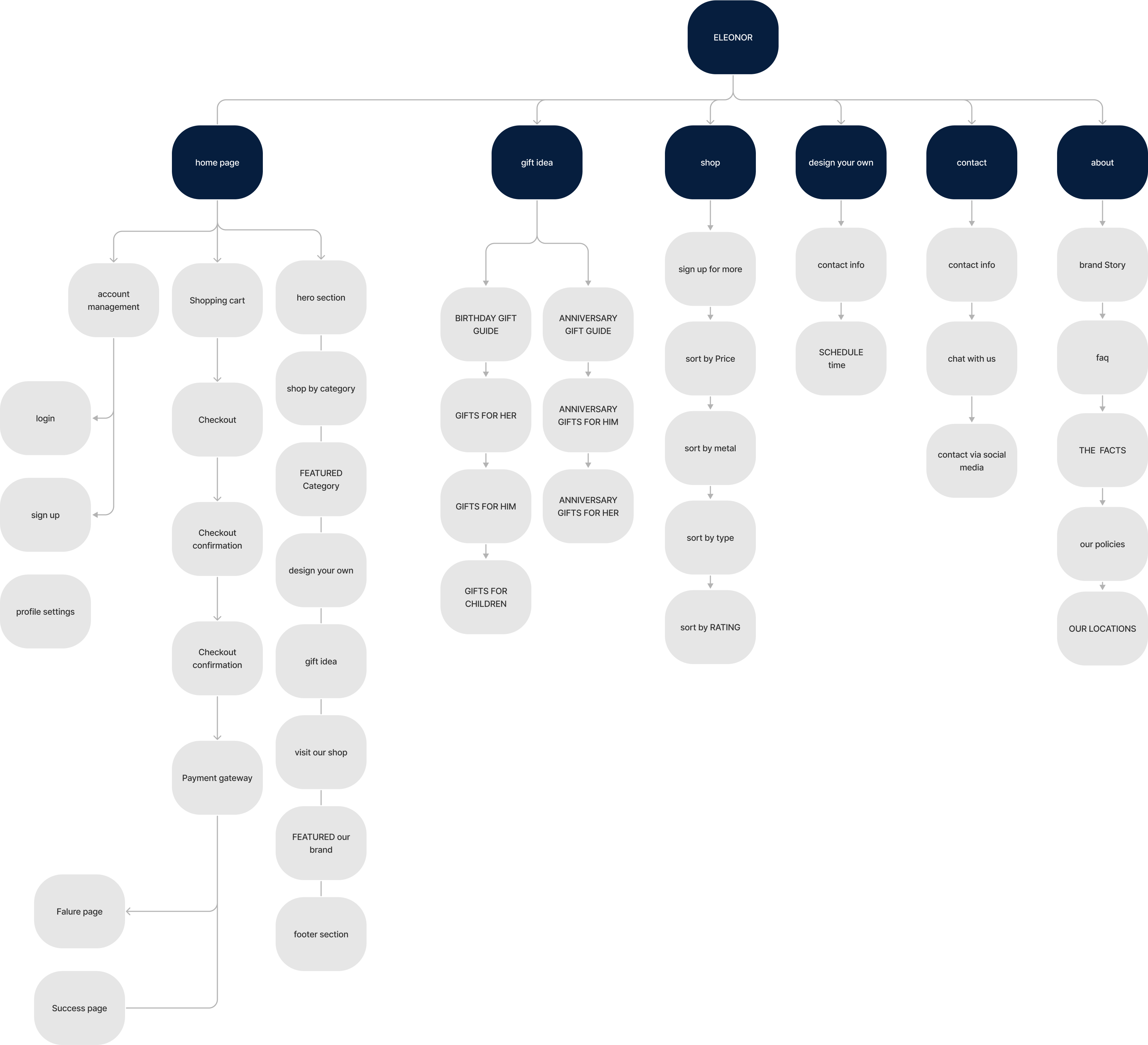
Sketching
@1x.png)
@1x.png)
Wireframing
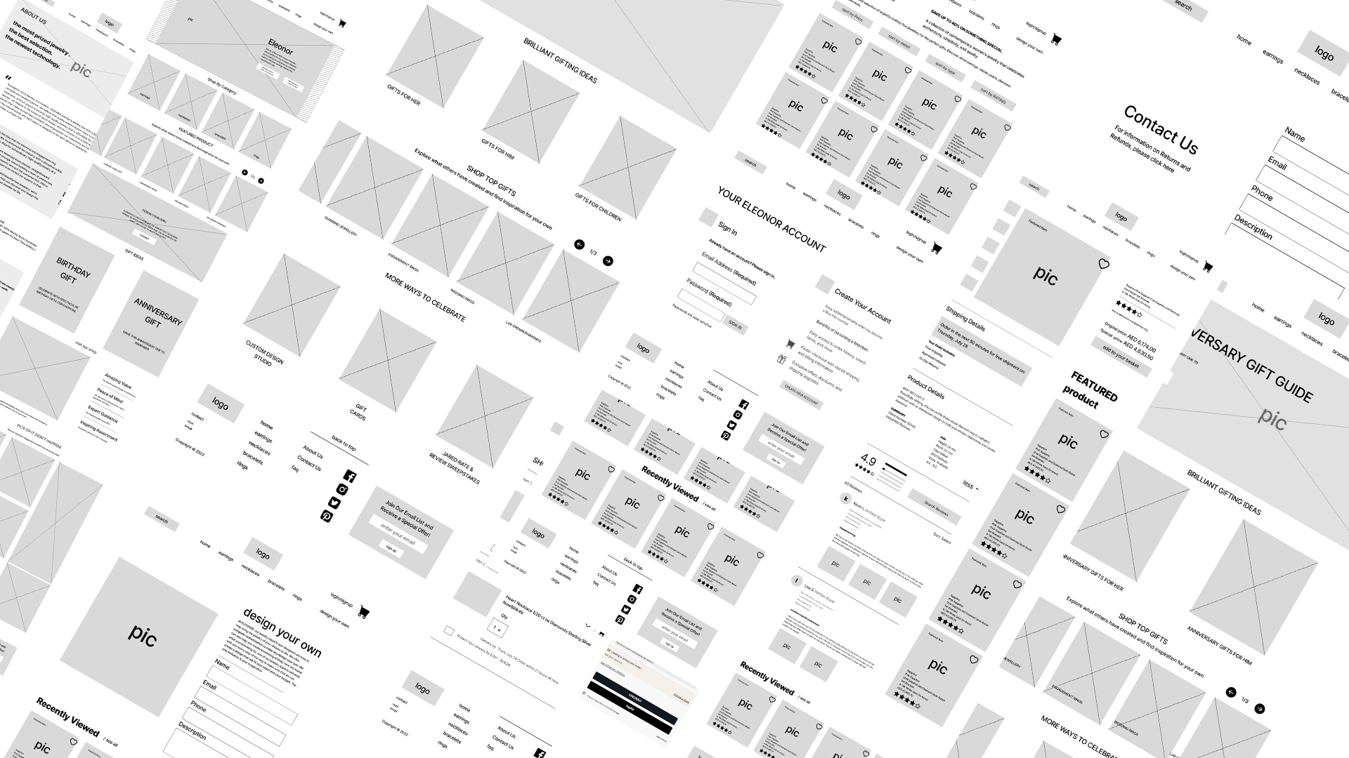
prototyping Wireframe
task flow
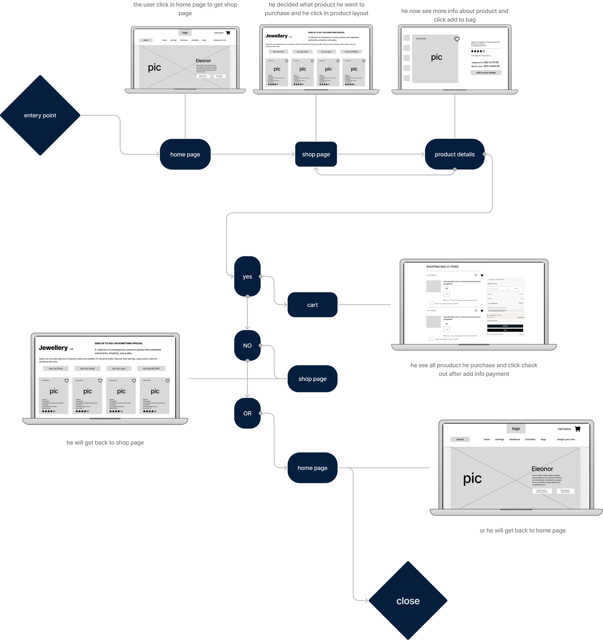
UI Approaches
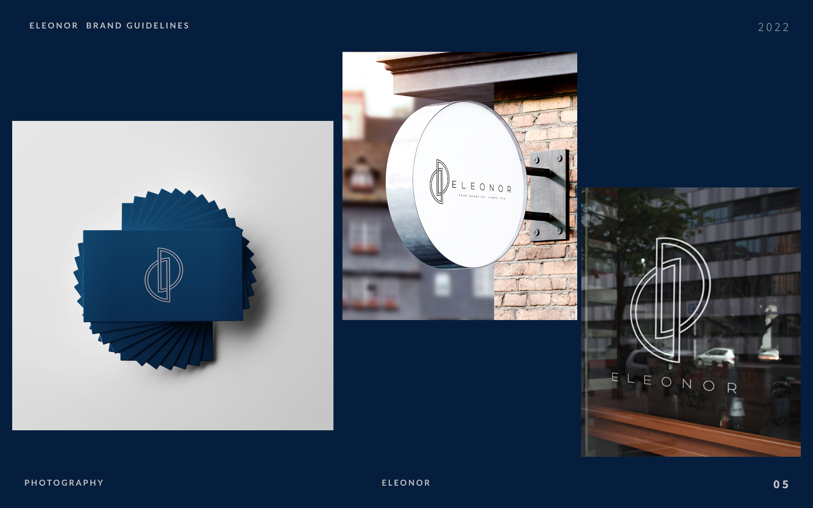
Brand Guidelines
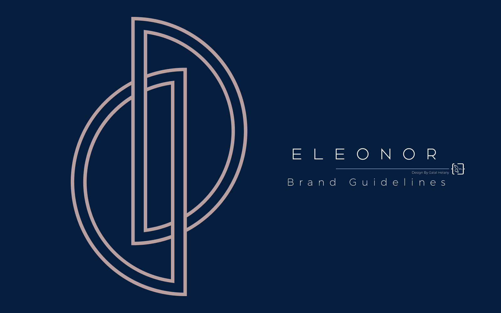
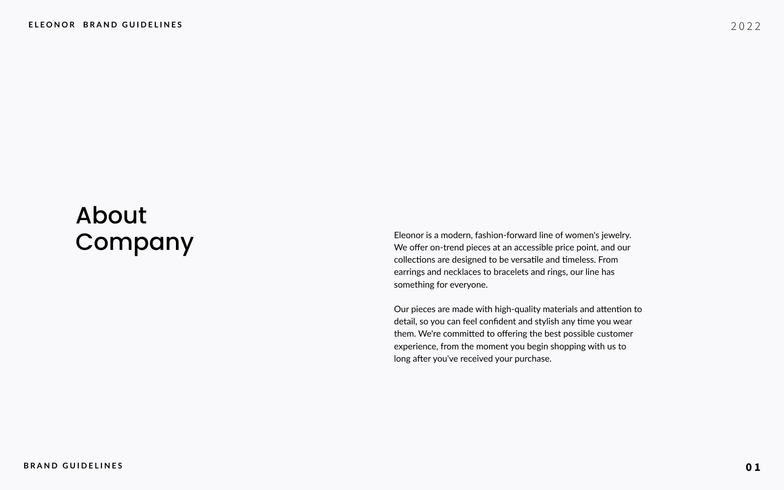
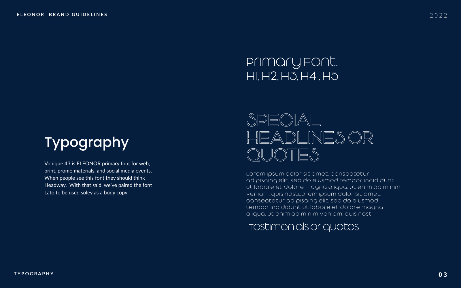
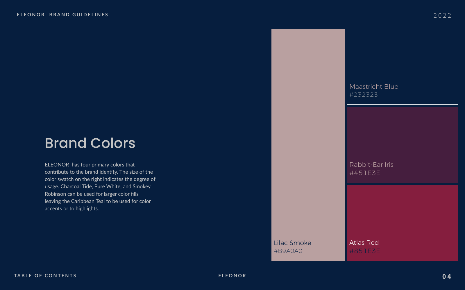
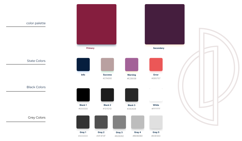
color palette
Typography

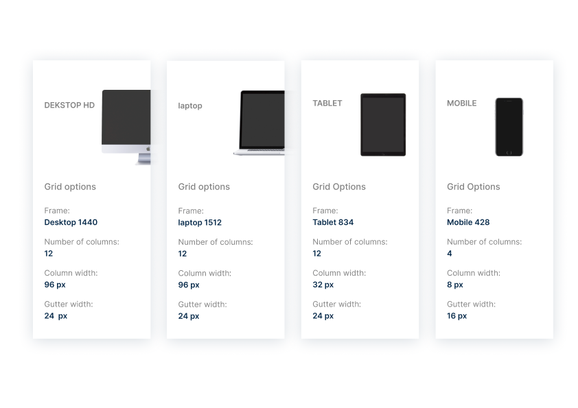
Grid Systems
icon & button
Final UI
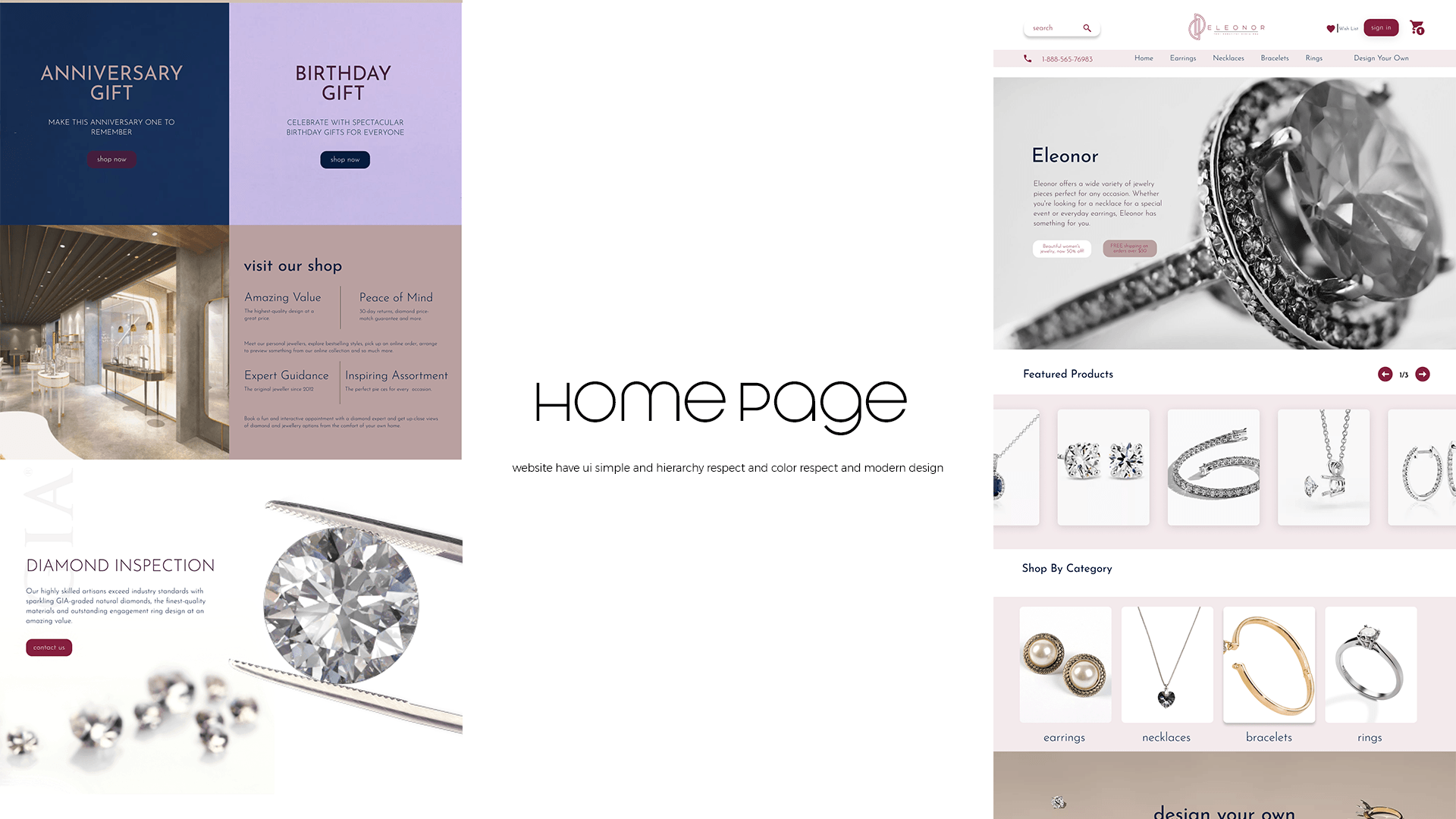
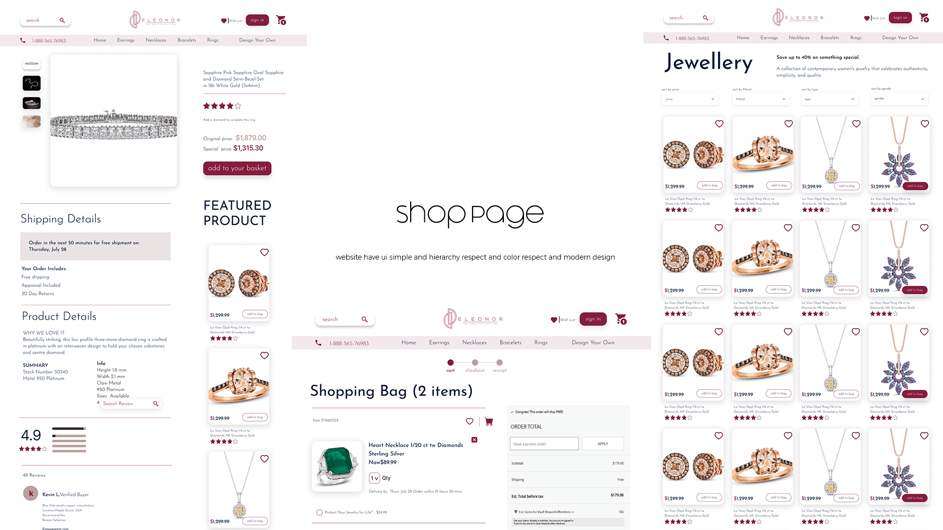
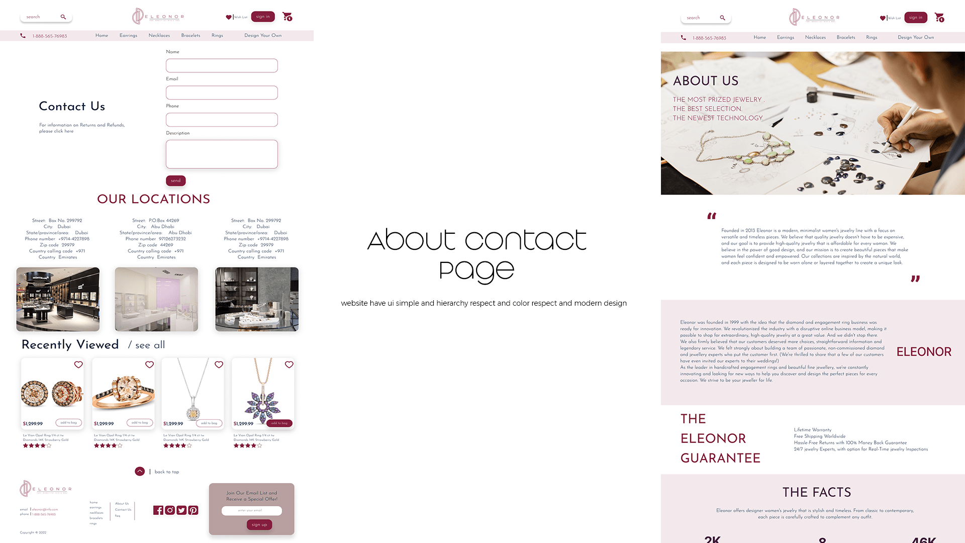
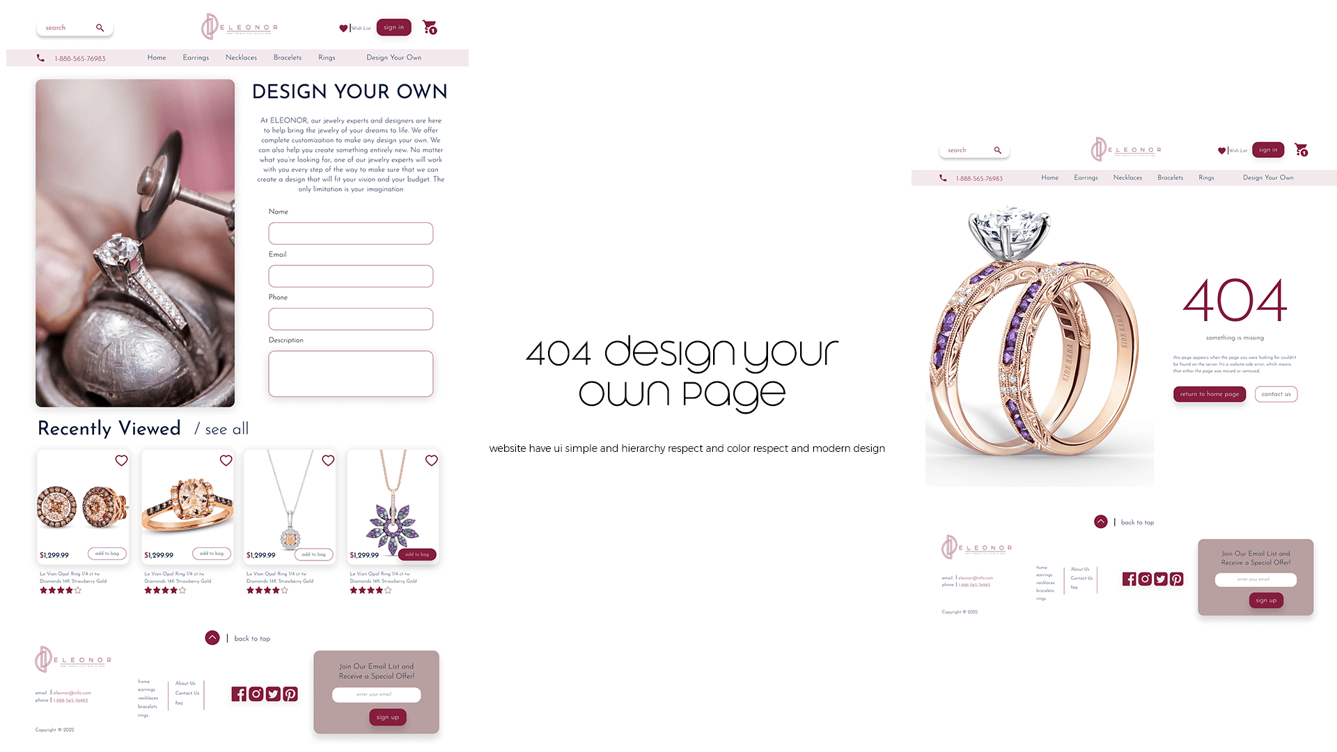
prototyping
responsive mobile design
